Overview
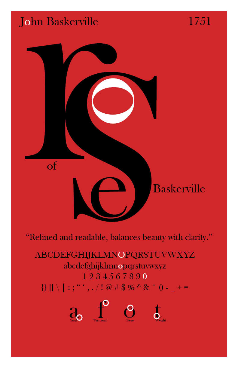
This project focused on exploring typography using the Baskerville typeface. The goal was to understand hierarchy, spacing, and how type can communicate both meaning and emotion. I used contrast, alignment, and scale to guide the viewer through the composition while keeping the design clean and readable.
Process
Step 1 – Research
I studied the history and characteristics of Baskerville, focusing on its high contrast and elegant structure.
I studied the history and characteristics of Baskerville, focusing on its high contrast and elegant structure.
Step 2 – Layout Development
I experimented with different grid systems, spacing, and alignment to create a balanced composition.
I experimented with different grid systems, spacing, and alignment to create a balanced composition.
Step 3 – Refinement
I adjusted hierarchy, kerning, and spacing to improve readability and visual flow.
I adjusted hierarchy, kerning, and spacing to improve readability and visual flow.
Final Presentation
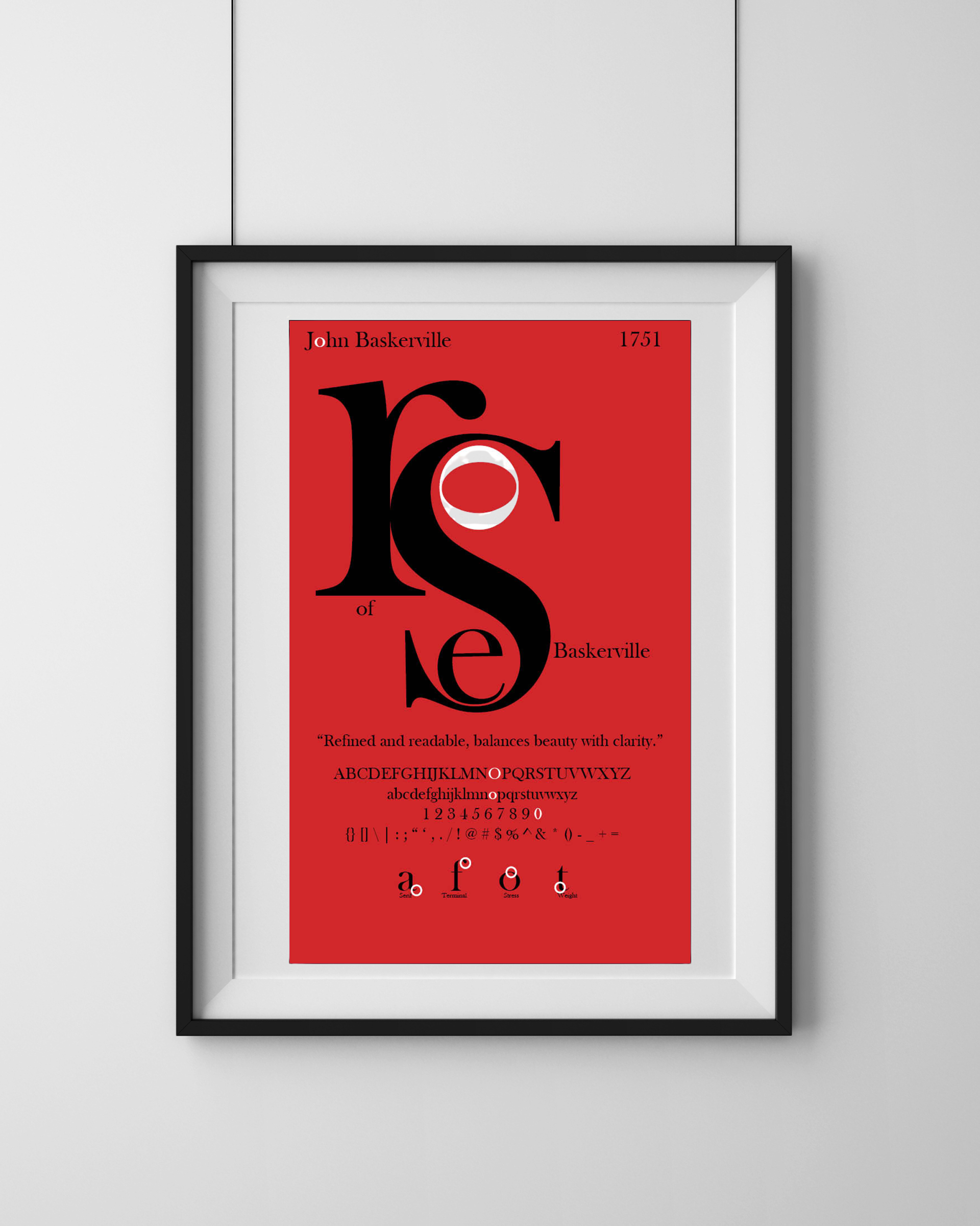
The final design is presented as a full-scale poster using mockups to show how it would appear in a real-world setting. This helps demonstrate how the typography functions at a larger size and in context.
Reflection
This project helped me better understand how typography works beyond just choosing a font. I learned how spacing, hierarchy, and alignment all work together to communicate a message clearly.