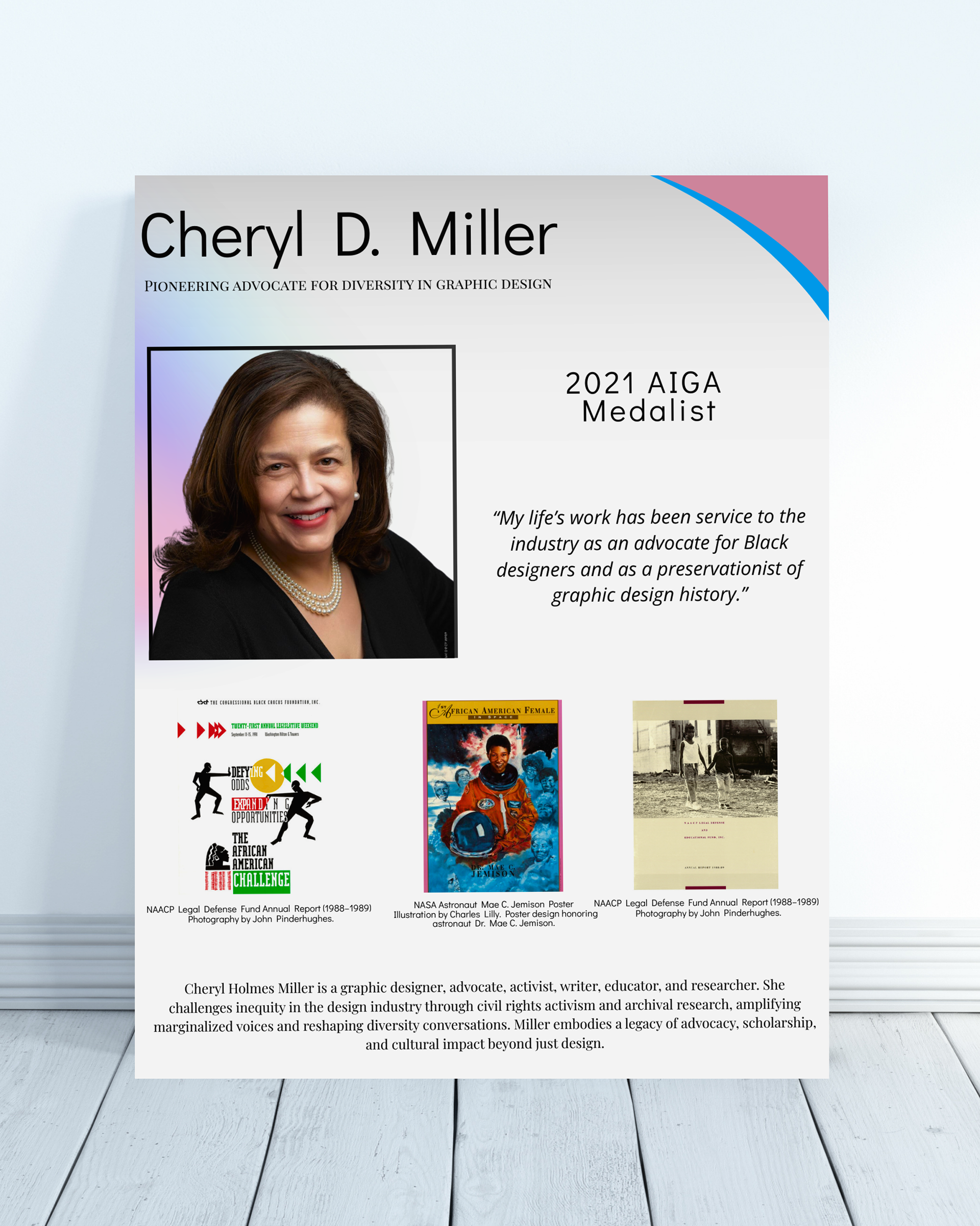
Overview
This project focused on creating a poster that highlights Cheryl D. Miller and her impact on graphic design. The goal was to present her work and legacy in a way that is both informative and visually engaging. I wanted the design to feel strong, structured, and respectful of her influence in the field.
Process
Step 1 – Research
I started by researching Cheryl D. Miller and her impact on graphic design, particularly her advocacy for diversity and representation. I focused on understanding her influence so the design would reflect her legacy in a meaningful way.
I started by researching Cheryl D. Miller and her impact on graphic design, particularly her advocacy for diversity and representation. I focused on understanding her influence so the design would reflect her legacy in a meaningful way.
Step 2 – Concept Development
I explored different layout ideas that would highlight both her portrait and her work. I wanted the design to feel strong and structured while still allowing space for supporting visuals and information.
I explored different layout ideas that would highlight both her portrait and her work. I wanted the design to feel strong and structured while still allowing space for supporting visuals and information.
Step 3 – Layout and Composition
I built the composition using a grid to organize the text, images, and supporting elements. I experimented with placement, scale, and alignment to create balance across the page.
I built the composition using a grid to organize the text, images, and supporting elements. I experimented with placement, scale, and alignment to create balance across the page.
Step 4 – Typography and Color
I selected typefaces and adjusted hierarchy to make sure the information was clear and readable. I used color and contrast to guide the viewer’s attention and support the overall tone of the piece.
I selected typefaces and adjusted hierarchy to make sure the information was clear and readable. I used color and contrast to guide the viewer’s attention and support the overall tone of the piece.
Step 5 – Refinement
I made adjustments to spacing, alignment, and visual balance to improve the overall flow. This step helped bring everything together into a more polished final design.
I made adjustments to spacing, alignment, and visual balance to improve the overall flow. This step helped bring everything together into a more polished final design.
Final Presentation
The final poster is presented with mockups to show how it would appear in print. Displaying the design in a real-world setting helps communicate scale, readability, and overall composition. The use of mockups also adds a professional level of presentation beyond the flat design.
Reflection
This project helped me understand how to balance visual design with informational content. I learned how to organize multiple elements on a page without overwhelming the viewer. It also strengthened my ability to use typography and layout to guide attention and communicate meaning clearly.