Overview
This editorial spread is based on Beatrice Warde’s ideas about typography. The goal was to design a readable and visually engaging layout that supports the content without distracting from it.
Process
Step 1 – Content Analysis
I reviewed the text and identified key sections and hierarchy.
I reviewed the text and identified key sections and hierarchy.
Step 2 – Grid System
I created a grid to organize text, images, and spacing.
I created a grid to organize text, images, and spacing.
Step 3 – Typography Choices
I selected typefaces and adjusted spacing for readability.
I selected typefaces and adjusted spacing for readability.
Final Presentation
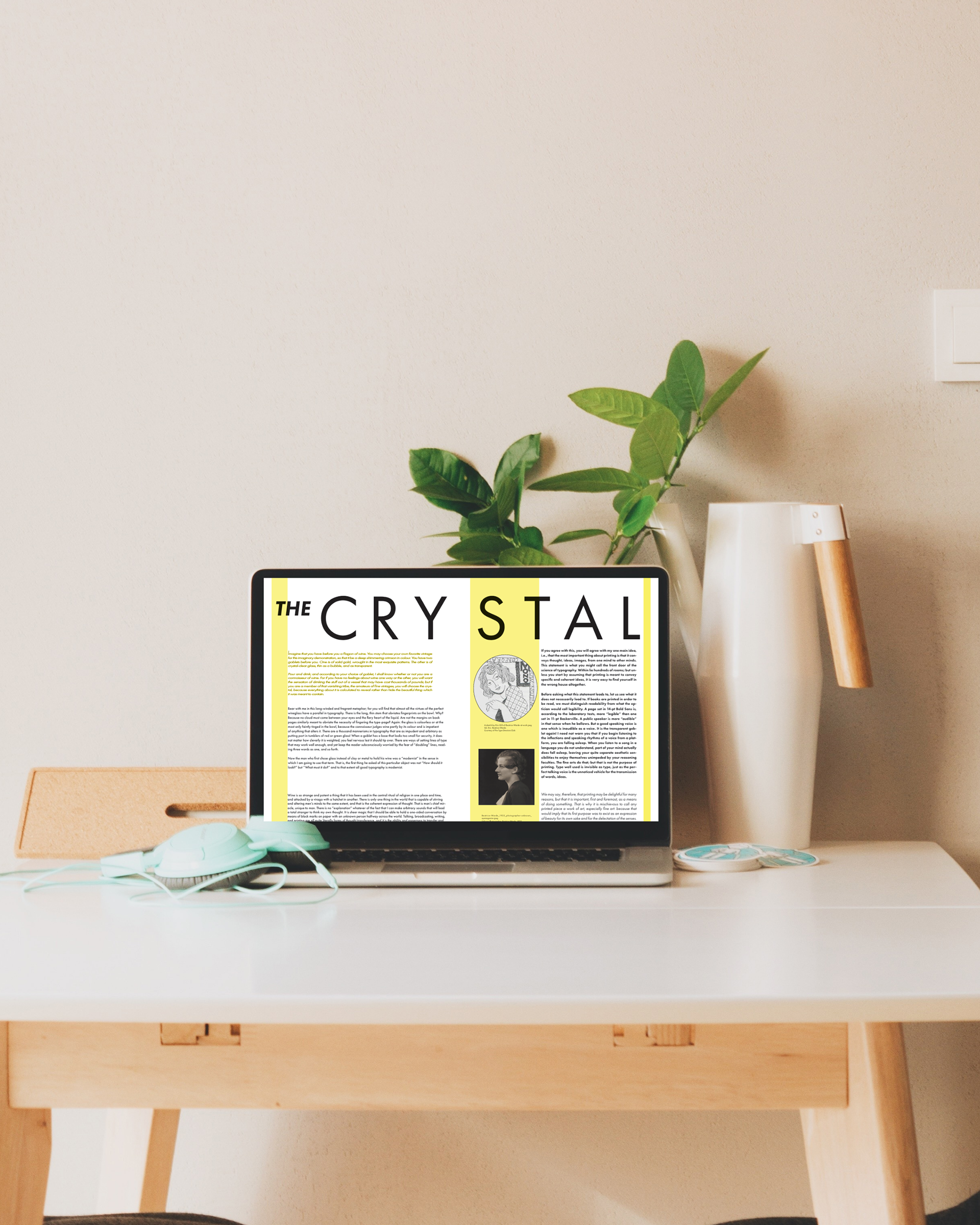
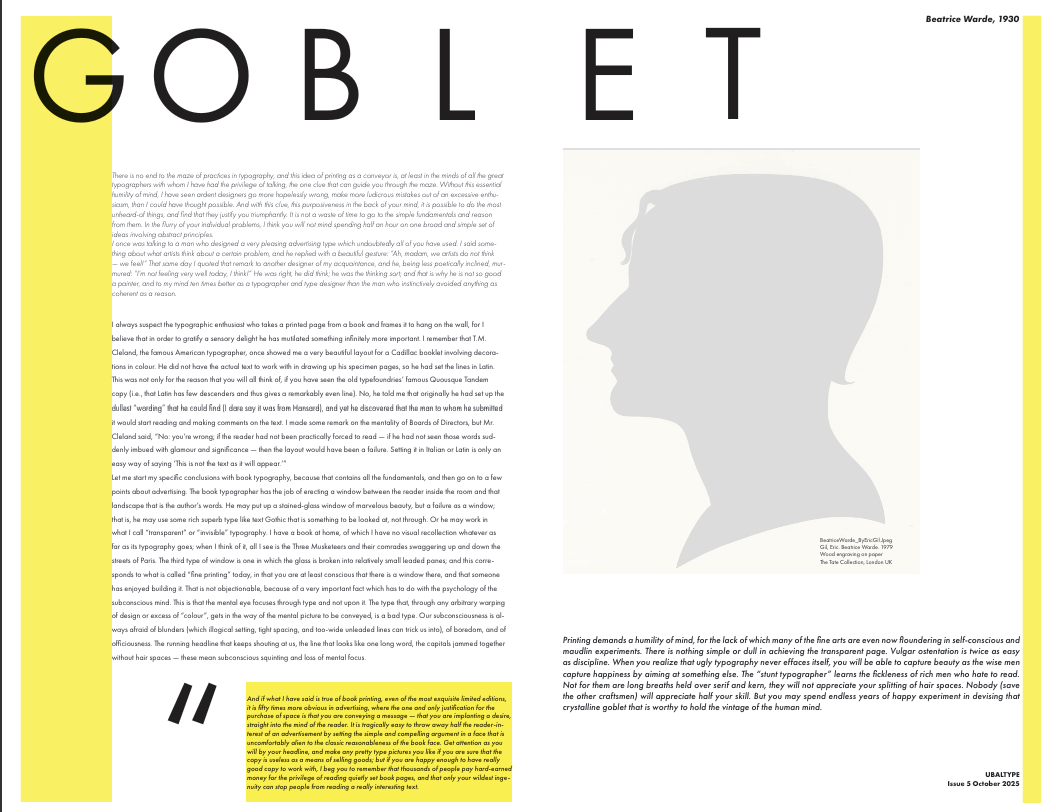
The spread is shown in magazine-style mockups to demonstrate how it would appear in print. This highlights layout consistency and readability.
Reflection
This project helped me understand how important layout is in guiding the reader. I focused on making the design feel clean and easy to follow.